
Why Color Psychology Matters in Healthcare Design
-
Studies show that specific colors affect mood and physiological responses.
-
Patients may feel anxious before appointments; calming colors can lower perceived stress.
-
The right shades can also help doctors and staff feel more energized and focused.
Colors That Promote Calmness and Trust
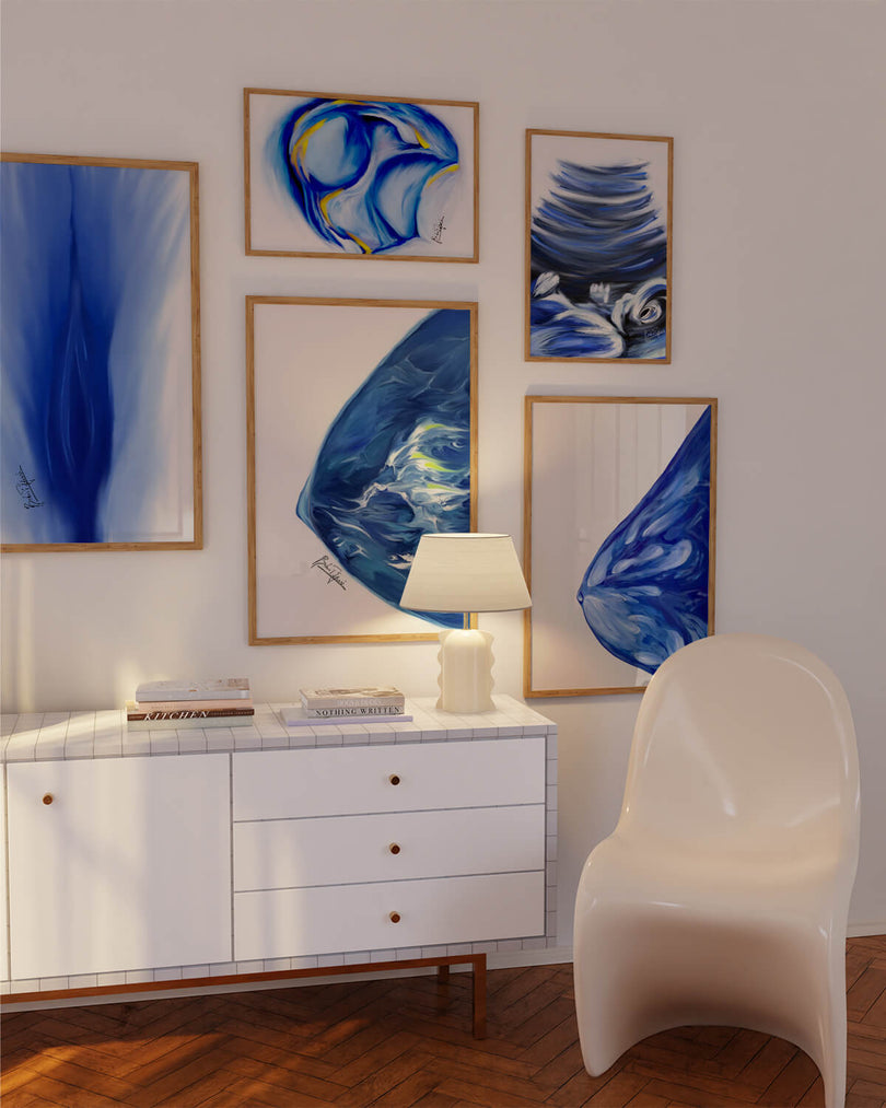
Blues: Often linked with trust, stability, and professionalism — great for consultation rooms.
Greens: Associated with healing and balance; ideal for waiting areas.
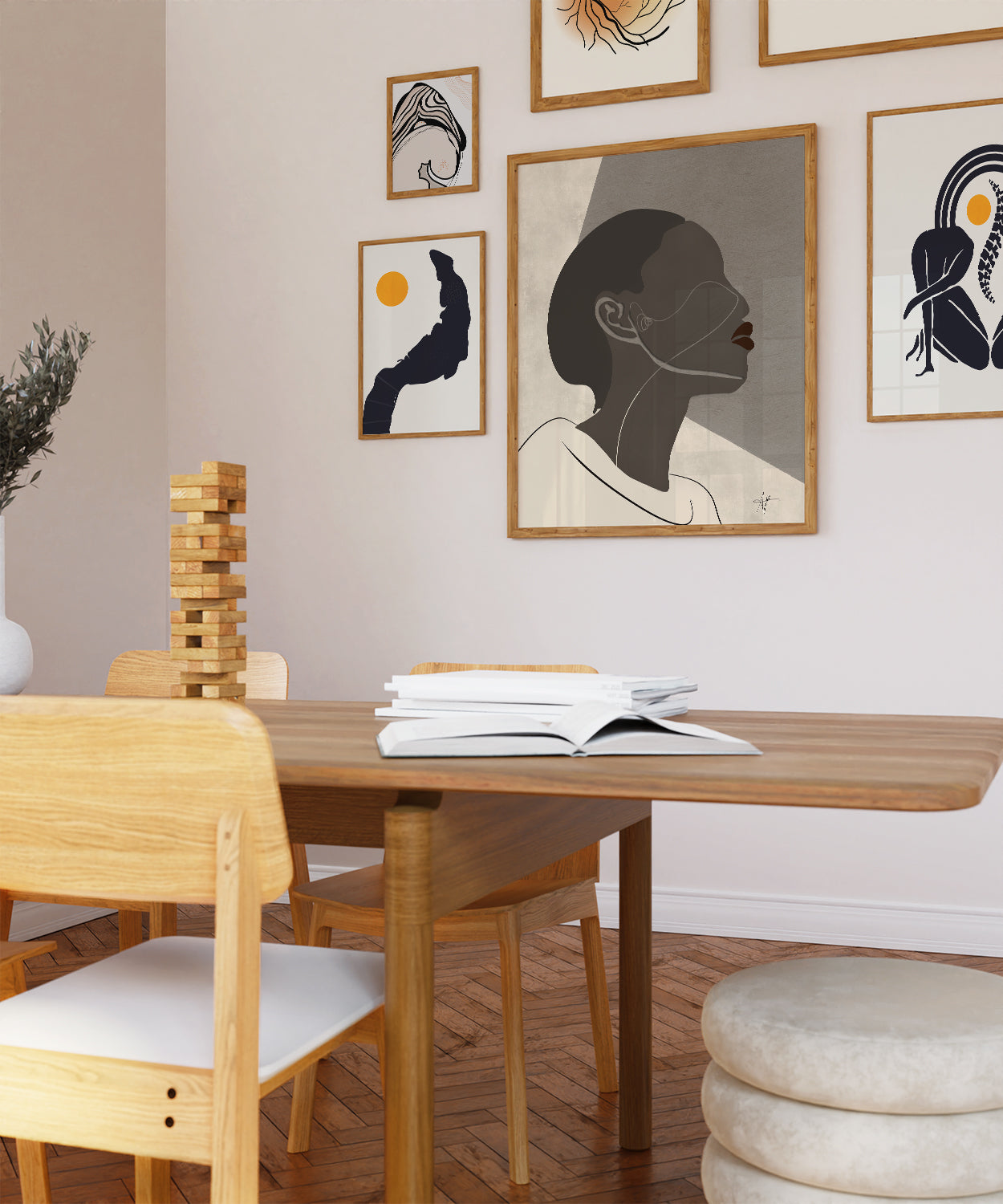
Soft Neutrals: Beige, cream, and soft grey provide a non-distracting background that feels safe.

Colors That Boost Energy and Engagement
-
Warm yellows in moderation can uplift mood in rehabilitation areas.
-
Coral or peach accents can make pediatric spaces feel friendly without overstimulation.
Combining Color with Art for Maximum Effect
Art can enhance the emotional effect of your color palette. For example:
-
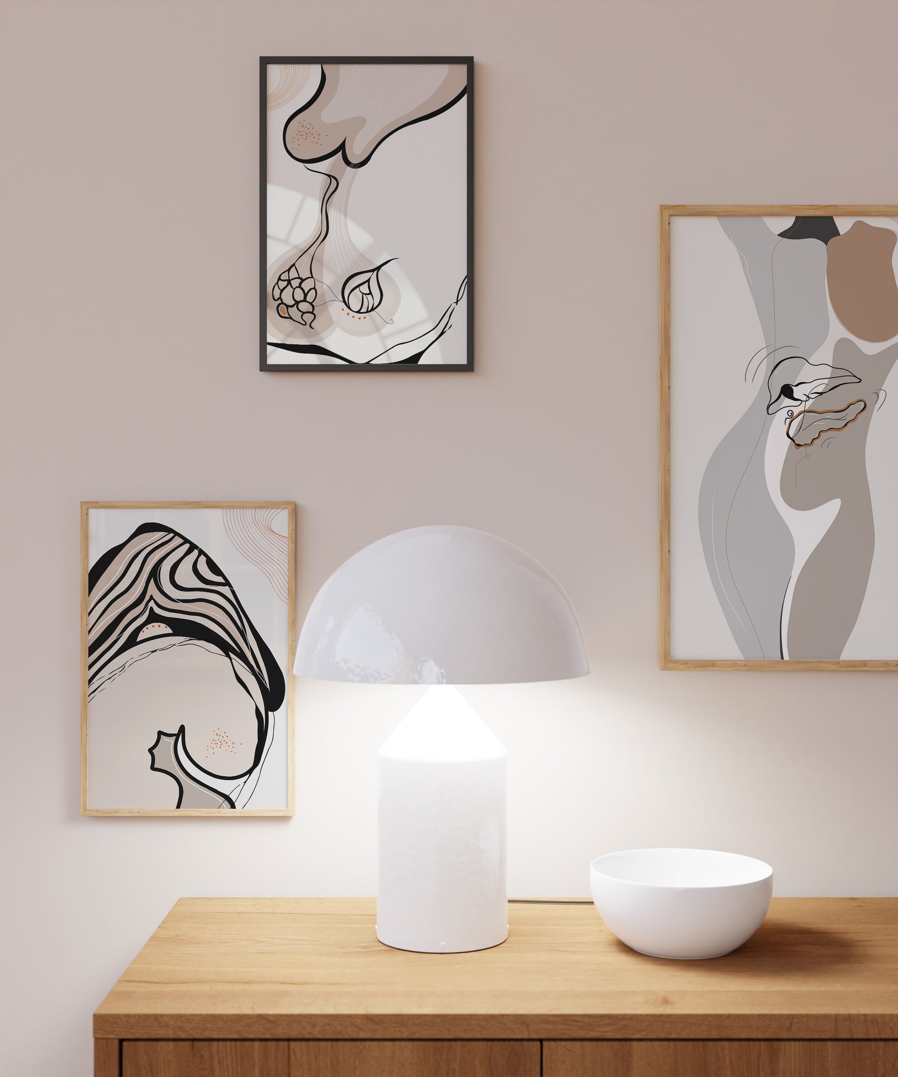
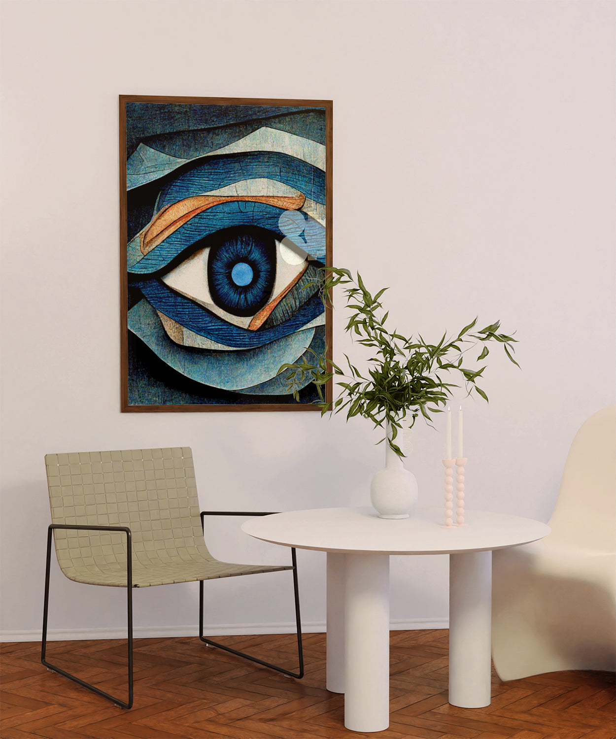
Blue walls with anatomy art in soft, muted tones create a calming yet intellectually stimulating space.
-
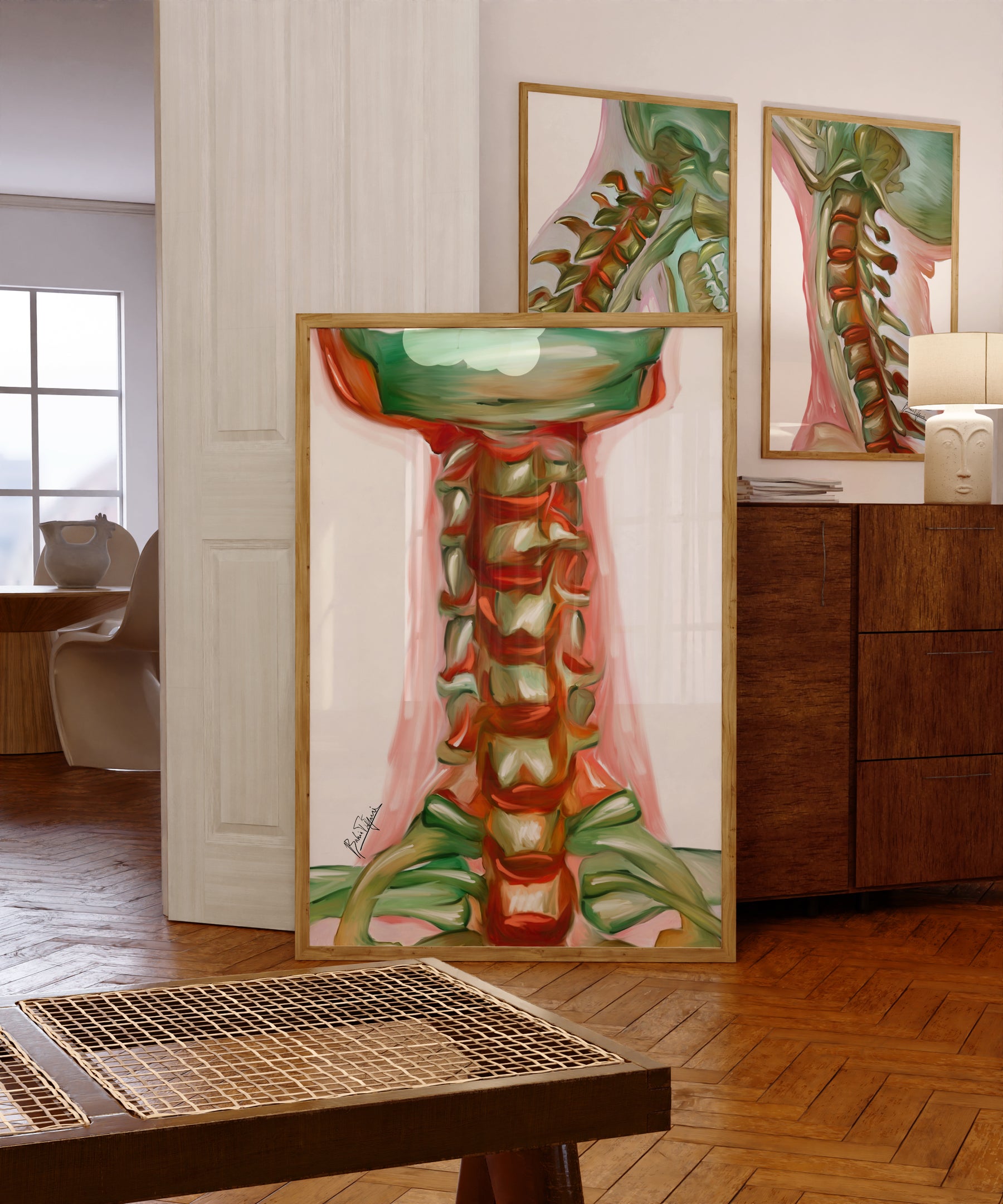
Green accents paired with botanical medical illustrations connect to nature’s healing power.
Practical Tips for Choosing Colors in Your Clinic
-
Consider natural lighting — colors look different in artificial vs. daylight.
-
Test paint samples on multiple walls before committing.
-
Use artwork to introduce secondary colors without repainting.
Bring harmony to your clinic with calming, professional artwork. Explore anatomy art prints at drartwork.com and find designs that match your ideal color palette.